Blog
Perspective
Explore our perspective on SEO, PPC, Data, Digital Consumer Intelligence and more.


Revealing Problematic Accuracy Gaps in AI Data Citations
Accidental Discoveries From an Investigation Into Chart Accessibility
Read the blog >
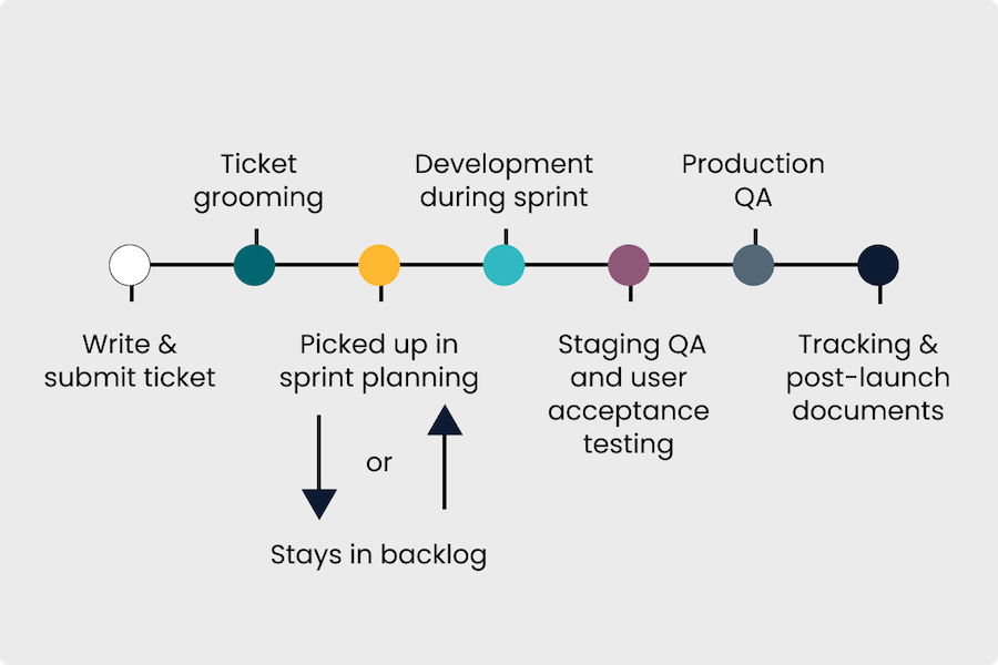
How to Write SEO Engineering Tickets That Streamline Implementation
A Section-by-Section Framework With Tips, Tactics, and Examples
Read the blog >
How Do AI Bots Crawl the Web & What Does It Mean for Your Site?
A Guide to Auditing Crawl Accessibility & Quality From a GEO Perspective
Read the blog >

How to Optimize Pagination for SEO
A Guide to Getting Things Right While Serving a User-First Implementation
Read the blog >

If LLMs Are the Future of Search, What Should My Business Do Today?
Need-to-knows about LLM brand visibility & benchmarking for marketing leaders.
Read the blog >
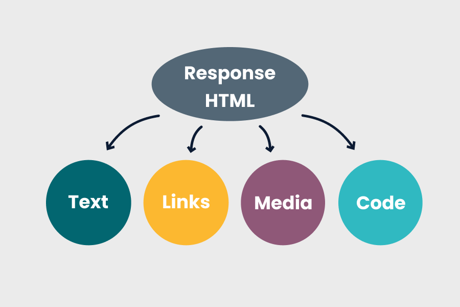
Diagnosing Common JavaScript SEO Issues
How to Connect the Dots from Onsite Symptoms (Even If You’re Not a Dev!)
Read the blog >

Crawling & Indexing Signals for SEO
How to Use Robots.txt, Meta Robots, and Canonical Tags Correctly
Read the blog >

DMI Insights
Turning Everyday Marketing Data Into Game-Changing Market Intelligence
Read the blog >

Implementing an SEO QA Process & Checklist
Turn Quality Assurance Into SEO Insurance
Read the blog >

Organic Traffic Down?
Don't Panic! Here's How To Find & Diagnose the Real Issue
Read the blog >

How to Write SEO Product Requirements Documentation
Serve Stakeholders & Streamline Projects
Read the blog >
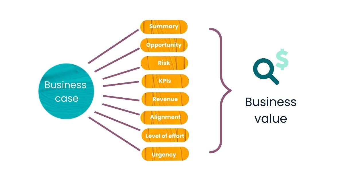
How to Create an SEO Business Case That Gets Traction
Read the blog >

9 Overlooked Examples of User-Generated Content That Drive SEO Growth
Read the blog >

How to Create a Marketing Measurement Plan That Defines What Matters
Read the blog >

The UGC SEO Playbook
How to Implement a Strategy That Sparks Scalable, Automated Growth
Read the blog >

Content Pruning SEO
How to Resolve Cannibalization & Improve Quality 🤝
Read the blog >
![Next-Gen SEO Content Planning & Keyword Matrix [Free Airtable Template]](https://assets.thegray.company/f/1016570/1250x712/e3e00e513f/airtable-content-seo-keyword-matrix-template-og-image.jpg)
Next-Gen SEO Content Planning & Keyword Matrix
A Free Airtable Template
Read the blog >

Scaling SEO: A Framework
Read the blog >

How to Plan & Implement Schema Markup, Avoiding Common Mistakes
Read the blog >

Brand Positioning & SEO
Aligning User Intent, Data with Brand Strategy
Read the blog >
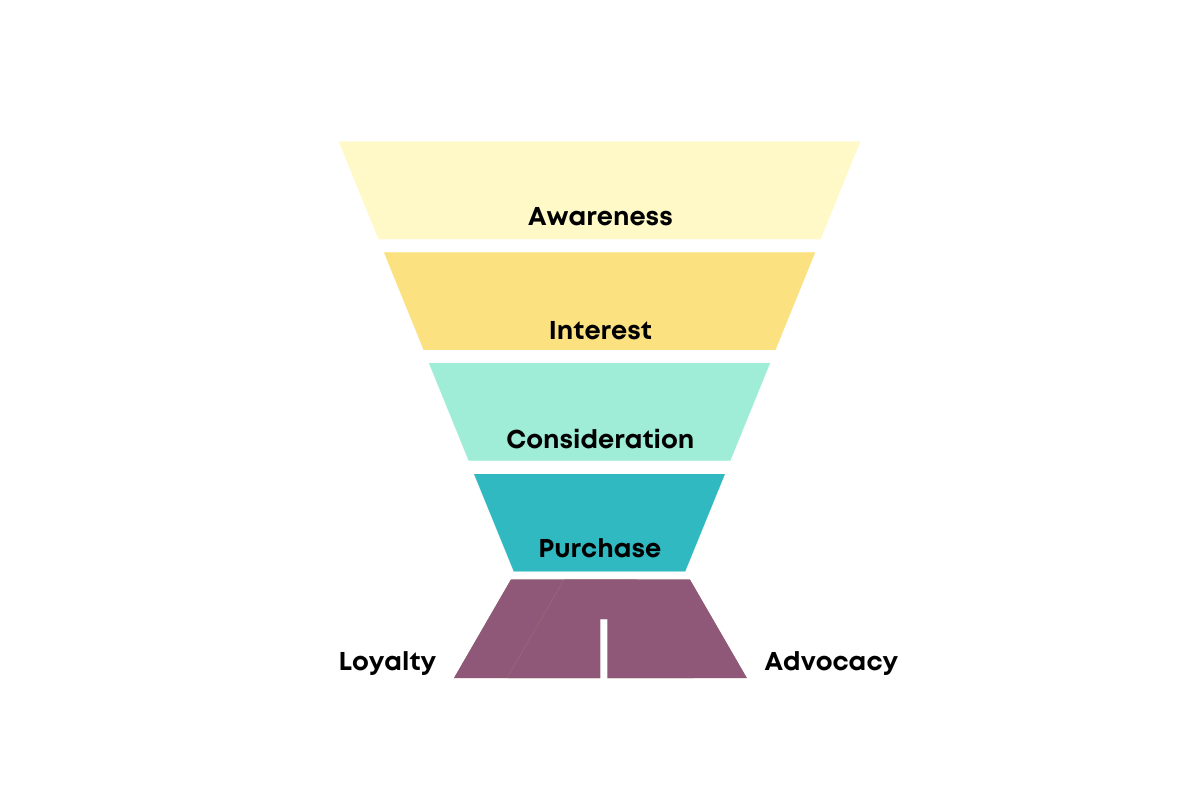
The SEO Customer Funnel
KPIs & SEO Metrics Worth Monitoring
Read the blog >

PPC Audit Methodology
An Expert's Workflow + Real-World Examples
Read the blog >

How to Work With Zero Search Volume Keywords
A Process for Finding & Leveraging Low to No-Volume SEO Keywords
Read the blog >

SEO for Startups Part II
What SEO Elements to Leverage and When?
Read the blog >

Should Your Startup Do SEO Now?
The “It Depends” Startup SEO Question List
Read the blog >

Information Architecture Best Practices for Advanced SEO & UX
Read the blog >

The eCommerce Technical SEO Framework
Making the Ambiguous Approachable
Read the blog >

How to Level Up Internal Linking for SEO, UX, & Conversion
Read the blog >

How to Do A JavaScript Audit for SEO
Read the blog >

Personalization & SEO
How to Optimize for Personalized Search
Read the blog >

Free SEO Templates from the SEO Community
Kickoff & Improve SEO Work
Read the blog >

How to Handle Permanently and Temporarily Out-of-Stock Products for eCommerce SEO & UX
Read the blog >

Duplicate Content & International SEO, Hreflang
Read the blog >

UX and SEO
How UX Design Can Help With SEO Concerns
Read the blog >

Best Practices for Faceted Navigation & SEO
eCommerce Facets, Filters, and Sort Order
Read the blog >
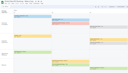
How to Create an SEO Roadmap
Connecting the Dots Between Strategy & Success
Read the blog >

What's in an SEO-friendly URL?
Best Practices for URLs
Read the blog >

How to Recover Traffic If a Migration Goes Wrong
Read the blog >

How to Plan an SEO Migration Strategy for Your Website
Read the blog >

The Art of Keyword Selection
How to Find, Choose, & Use the Best Keywords for SEO (and Conversions)
Read the blog >

How To Properly Serve Up 404s on Single Page Application (SPA) Pages for SEO
Read the blog >

SEO Internationalization Best Practices & QA Checklist
Read the blog >

Should I Choose a Multiple Domain SEO Strategy?
The Why, What, When
Read the blog >

International SEO Technical Specs (+ Business Decision Insights)
Read the blog >

Error 404 Guide for SEO & Usability (FAQs & More)
Read the blog >

How to Deindex "Stuff" from Google Quickly & Effectively
Read the blog >

Google Search Console Errors
A Guide to Finding & Fixing the Most Common GSC Errors
Read the blog >

50+ of the Best SEO Resources
Tools, Educational Resources, and More
Read the blog >